This website and its content are not intended to provide professional or financial advice. The views expressed here are based solely on the writer’s opinion, research, and personal experience, and should not be taken as factual information. The author is not a financial advisor and lacks relevant certifications in that regard. We highly recommend consulting a qualified financial advisor before making any investment decisions, as the information presented on this site is general in nature and may not be tailored to individual needs or circumstances.
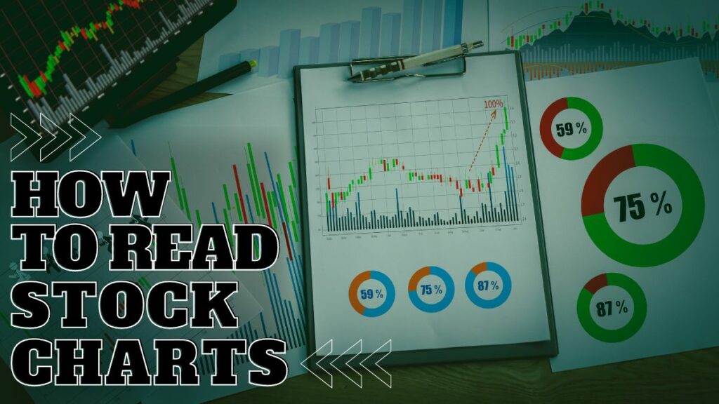
Reading stock charts can be hard, especially for beginners. Advanced traders use different techniques to understand how a market is developing but, at the end of the day, the main function of correctly reading stock charts is one: understanding when it’s time to open a position.
In this complete guide on how to read price charts, we will provide you with actionable advice to understand how stock prices are moving – and identify the right moment to buy or sell.
Contents
The anatomy of a stock price chart
A price chart is, in short, a chart where you can find a graphical representation of prices for a given stock.
To give you this representation, price charts use mainly two tools:
- Lines,
- Candlesticks.
Lines are simple representations of the last price witnessed in a given session: they link closing prices and you can use them with different timeframes – for instance, hourly or daily.
For instance, if you choose to observe prices represented by an hourly price chart, the line will represent the closing price for each hour.
Lines were the standard in price charts until the Eighties, but then, the Japanese technique became more common among Western traders.
The Japanese technique uses candlesticks to represent prices. They were imported from Japan by Steve Nison, who published Japanese Candlestick Charting Techniques in 1991.
Japanese candlesticks are more talkative than simple lines.
A candlestick represents not only the starting and ending price and its development, but also the lowest and the highest prices reached by the stock during a specific session.
Candlesticks are a fundamental element of price charts, because they’re actually what represent prices graphically. But they’re not the only element.
Reading stock price charts falls into the field of technical analysis. Technical analysts know very well that prices alone don’t give you enough information.
Another element that is pivotal in reading prices is trading volume.
If prices represent the behavior’s of a stock, volume represents what traders are actually doing. In fact, volume is among the most objective indicators you can find in price charts, and it’s so important that volume often comes as a tool automatically included in all the platforms that collect prices to provide you with price charts.
Other elements to consider to correctly read a stock chart
Platforms that offer price charts give you more elements to make a reliable analysis.
Price charts are extremely useful if you want to make a technical analysis based on historical prices and volumes, to try to individuate patterns (more on this later!) and predict what will happen – to act accordingly.
But when it comes to stocks, there are two other elements to consider: dividends and splits.
Stock dividends are payments to shareholders in the form of stocks – they differ from cash dividends, paid – as the name suggests – in cash according to the shares owned by each shareholder.
Splits consists of an increased amount of shares available – a move usually made by companies that need to raise additional funds.
Stock charts usually tell you when these events occur, because they can affect prices.
In fact, when the company uses stock dividends and splits, it’s increasing the number of shares available in the market.
So, if all other conditions are equal and according to the supply and demand law, the price of a stock tends to decrease when these events occur.
The importance of volume in reading stock charts
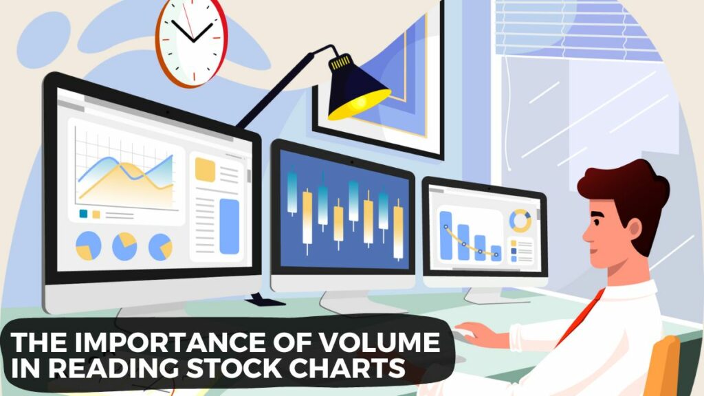
Trading, as well as any other activity that involves money, has mainly to do with people.
Volume, as we mentioned, represents what people do. Volume is the amount of stocks traded during a specific trading session.
Stocks are exchanged by traders, so, if you have a look at the amount of stock sold or bought, you know what traders are doing with that specific stock.
This helps you to better understand – or to validate – the patterns formed by prices in each chart.
The most common patterns to observe
There are some common – but still powerful – figures that, when identified, can help you to understand what are the possible future developments of the prices of that stock.
Trend lines
Trend lines give you an idea of how the market is performing – basically, they show you trends.
Trend lines can signal at least three different market movements:
- Uptrends, when the price of a stock is constantly going up, despite some possible minor corrections;
- Downtrends are the opposite, they occur when the price of a stock is going down;
- Sideways movements, which represent periods of accumulation (traders and investors accumulate stocks over time because they consider that the price is fairly low) and distribution (traders and investors sell stocks, since they think that the price will drop soon).
Remember: the more points you manage to link with a trend line, the more reliable the trend is.
Support and Resistance
Trend lines also help you to individuate support and resistance zones:
- Support zones can be individuated by drawing trend lines that link the lower prices shown by candlesticks. These zones represent range prices where buyers are strong enough to avoid the price to fall.
- Resistance zones, on the contrary, can be drawn by linking the higher prices shown by candlesticks. These zones are represented by price ranges where sellers are strong enough to avoid the price to go higher.
Support and resistance zones are usually found at specific Fibonacci levels.
Little note on Fibonacci levels
Named after the Italian mathematician Fibonacci, these levels can represent extensions or retracements expressed in percentage:
- The retracement level indicates how the priced retraced in respect with a prior price move,
- The extension represents the opposite, indicating how much the price increased in comparison with a prior move.
Traders and investors use these levels to try to predict where resistance and support zones can be, then, they act accordingly.
Fibonacci levels are a clear example of the fact that most modern traders and investors refuse the Random Walk Theory.
More complex technical patterns
- Triangles. Triangles are formed by two converging trend lines that actually seem to draw a triangle. Triangles can be ascending (they usually appear during an uptrend), symmetrical, or descending (usually during a downtrend). Triangles are confirmation patterns – that is, they usually confirm the current price movement.
- Flags. Flags are represented by parallel trend lines that form sort of price ranges within which the price tends to move. Like triangles, flags are consolidation patterns, but their term is usually shorter than triangles.
- Head and Shoulders. This is one of the most popular patterns among traders and investors. Its name derives from the fact that it is formed by three peaks – a central deeper peak and two lateral peaks similar in height – that make it look like a head between shoulders. The base of the peaks is a horizontal trendline. Differently from triangles and flags, “head and shoulders” is a reversal pattern – the inverted H&S usually signals that a downtrend is about to become an uptrend, while H&S signals the opposite.
Why stocks charts are different from the charts of other assets
If you’re a trader or investor interested also in assets different from stocks, you noticed that not all charts are equal.
To better understand this point, let’s make a comparison between stocks and cryptocurrencies.
The price charts of cryptocurrencies are continuous and full of peaks – when we consider cryptos different from stablecoins.
This happens because cryptocurrencies are traded 24/7 and are assets more volatile than stocks.
On the other hand, it is very common to find the so-called “gaps” in stock charts. This happens because stocks are not traded during nights, weekends and holidays. So, it is very common for traders and investors to set specific prices for their positions, which will be filled only once markets open. This is evident especially on Mondays – in fact, there is a whole theory about this called the “Weekend Effect”.
This theory tries to find the reasons behind the phenomenon that makes us observe how stock returns are usually lower on Monday. The main reasons seem to be two:
- People act irrationally,
- The number of sellers is usually higher on Mondays, following possible bad news published during the weekend.
Moreover, stocks are for sure less volatile than cryptocurrencies, so stock charts might seem more “stable”.
Terms to know and best platforms to read stock charts
If you want to know more about where to find the stock charts to read, consider our article about the best financial accounts.
In fact, best brokers and platforms related to investing always come with price charts to help you make informed decisions.
On those platforms you’ll find terms that it’s better to know to fully understand data:
- Bid and ask: the bid price is the price that other traders and investors are willing to pay for that specific stock. This is useful information to understand what your peers are doing, giving you an idea of the perceived value of that stock. The ask price is the opposite, since it tells you the price at which bears want to sell. Another common term is “spread”, which represents the difference between the two prices.
- Beta: this is an indicator of the volatility of prices. When the beta of a stock is measured, if it’s higher than one it means that the reference stock is more volatile if compared to the overall market. On the other hand, if it’s lower than 1, it means that the stock is less volatile than the whole market.
- P/E Ratio: P/E Ratio stands for “price-to-earnings ratio”. This indicator is used to understand how the value of a stock is perceived. In fact, it measures the price of the stock to the amount shareholders earn for each share. The P/E Ratio is used to understand if a stock is overvalued or undervalued, and to find similar stocks.
- 52-week high and low: these indicators show the highest and the lowest prices at which the stock has traded during the past 52 weeks.
Conclusion
Stock charts play a pivotal role when it comes to investing. Actually, without them you wouldn’t be able to invest or trade.
Most stock price charts collect prices in real time, and they are the faithful report of the meeting of supply and demand according to different stocks.
Moreover, today it is possible to always find more intuitive stock charts, as well as you can use different tools to make your analysis.
Being able to read stock charts is the first step towards a successful activity as investor and trader, but always consider the risks involved in this activity!
FAQs
The main elements of a stock price chart are lines and candlesticks. Lines link the closing prices of stocks in a given session and can be used with different timeframes, such as hourly or daily. Candlesticks, on the other hand, provide more detailed information, representing the opening, closing, highest, and lowest prices of a stock during a specific session. Other essential elements include trading volume, which shows the amount of stocks traded during a session and helps to understand or validate price patterns, as well as stock dividends and splits, which can affect stock prices.
Some common patterns to observe in stock price charts include trend lines, support and resistance zones, Fibonacci levels, triangles, flags, and head and shoulders patterns. Trend lines show market performance and can indicate uptrends, downtrends, or sideways movements. Support and resistance zones represent price ranges where buyers or sellers are strong enough to prevent the price from falling or rising, respectively. Fibonacci levels help predict potential support and resistance zones. Triangles and flags are consolidation patterns, while head and shoulders patterns are reversal patterns.
Stock charts differ from charts of other assets like cryptocurrencies due to differences in trading hours, volatility, and market behaviors. Stocks are not traded during nights, weekends, and holidays, which can lead to gaps in stock charts. Cryptocurrencies, however, are traded 24/7, resulting in continuous and more volatile price charts. Stocks are generally less volatile than cryptocurrencies, making stock charts appear more stable in comparison.
StockHax strives to provide unbiased and reliable information on cryptocurrency, finance, trading, and stocks. However, we cannot provide financial advice and urge users to do their own research and due diligence.
Read More